If you are a commission portrait artist like me, you’ve probably experienced moments of frustration when you haven’t quite captured the likeness in a portrait.
Over the last couple years, I have illustrated numerous portraits, and I have learned a thing or two about portraiture which I’d like to share with you. The following tips will help you achieve better likeness in your commissioned portraits and impress your clients.
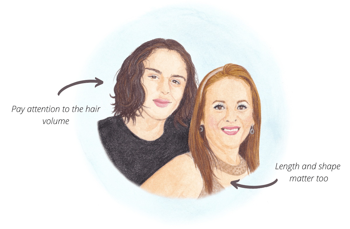
1. Hair Matters
When it comes to drawing portraits, one might assume the eyes are the most important feature. However, hair is also an important part we shouldn’t neglect. Hairstyle says a lot about the character of a subject.
Take this custom illustration, for example. At first, I drew the subject on the left with bulky hair. When I showed the illustration to my client she said she didn’t remember her relative (the subject) wearing his hair that way. After I thinned out some hair, the illustration looked a lot more like the reference photo.
Is it a big deal if we add/omit a few strings of hair? No. Will it affect the likeness? You bet.
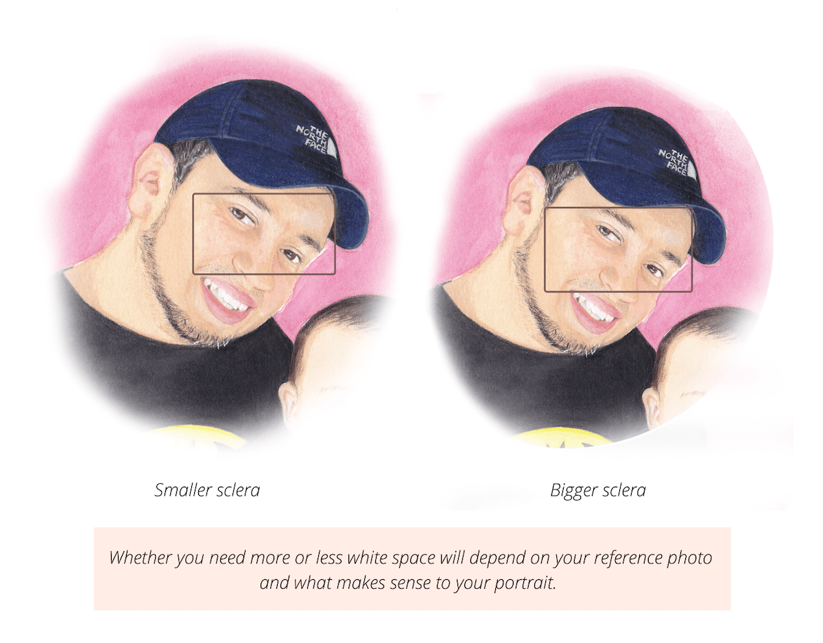
2. The White of the Eye
Whenever something feels off in a portrait, I always take a closer look at the sclera (also known as the white of the eye). Making this area bigger or smaller can drastically affect the likeness of a piece.
If the sclera on your portrait is too small and you’ve already colored the iris, you can fix this by applying some opaque white. I use permanent white gouache whenever I need to expand the white of the eye.
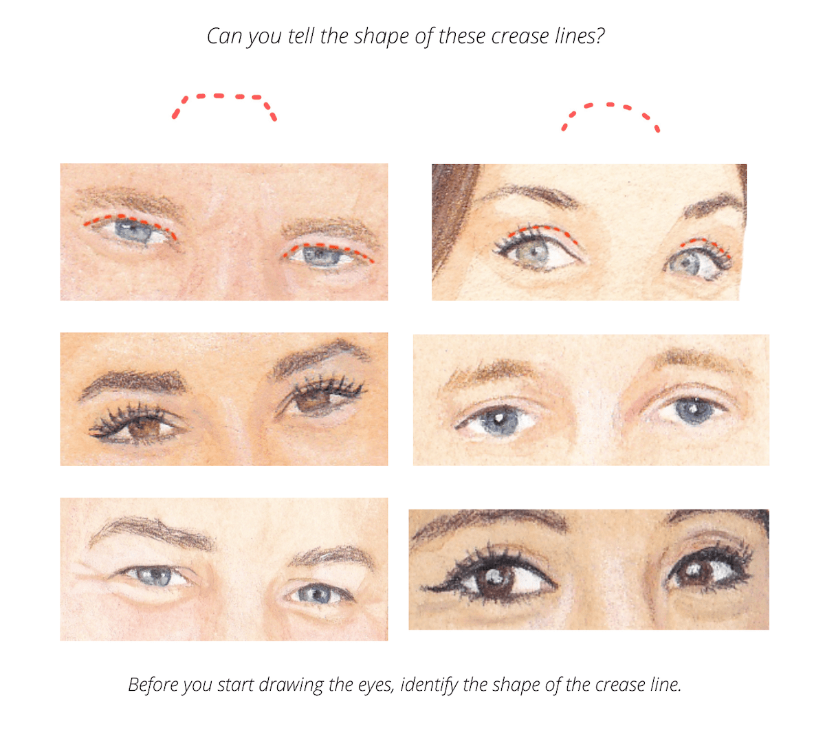
3. The Crease Line of the Eyelid
The crease line of the eyelid is one of my favorite parts to draw. It sets the tone for the whole eye. Sometimes this is a curved line, other times it will have a rectangular shape.
The depth and values of the line will also vary, being darker on its extremes. So don’t overlook this detail, and get it right from the beginning!
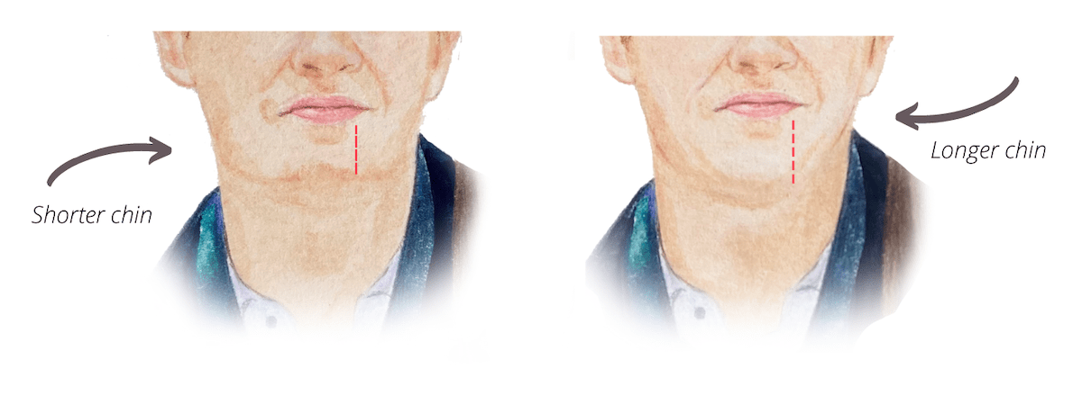
4. The Chin
It’s important to pay attention to the length of your subject’s chin. While it might not make a big difference to you, clients can tell if the chin is accurate.
In this example, I made the chin of the subject shorter, but when I showed the illustration to my client, she said her boyfriend’s chin was longer. I didn’t notice it at first because the reference photo had bad lighting, but after comparing a few more photos, I realized he indeed had a longer chin. So, I went ahead and made the necessary changes, and my client was much happier with the result.
5. Compare Two or More Photos
I always like to ask my clients for more than one reference photo, even if the photo they provided is of great quality. This is because I like to compare photos to get an idea of how the person looks in real life. By looking at different photos from different angles, you get to know your subject better. The more you study your photos in advance, the more confident you’ll feel during the painting process.
Another advantage of having multiple photos is that you get to choose the best reference photo! Clients aren’t usually good at selecting reference photos, but you are the artist and know what works best.
If you’d like to dive deeper into this topic, then download my FREE eBook, which contains 10 more tips to achieve better likeness in your commissioned portraits! ☺️